Customize chart
You can customize how chart data is displayed using legend settings, font controls, data label positions, axis configurations, and visual styles for each measure.
These options help improve readability, highlight specific metrics, or combine multiple visual formats in one chart.
On this page:
Data labels
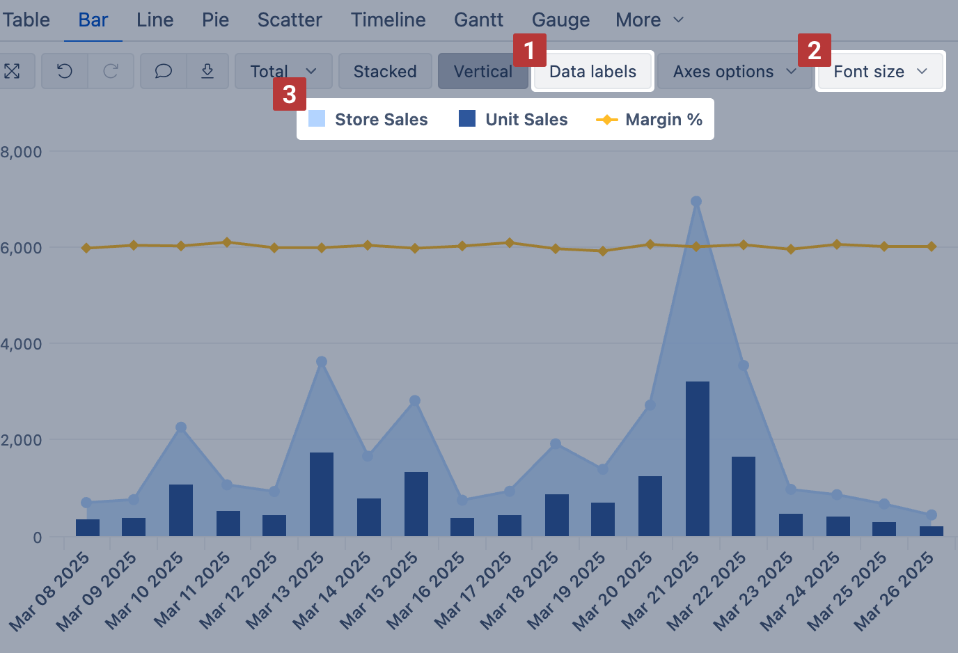
Select Data labels [1] to display measure values and change Font size [2] for better readability. For each measure, you may adjust the data label position.
The chart legend [3] contains a list of measures used in the chart. From here, you can adjust how the measures are displayed and organized.
Display options
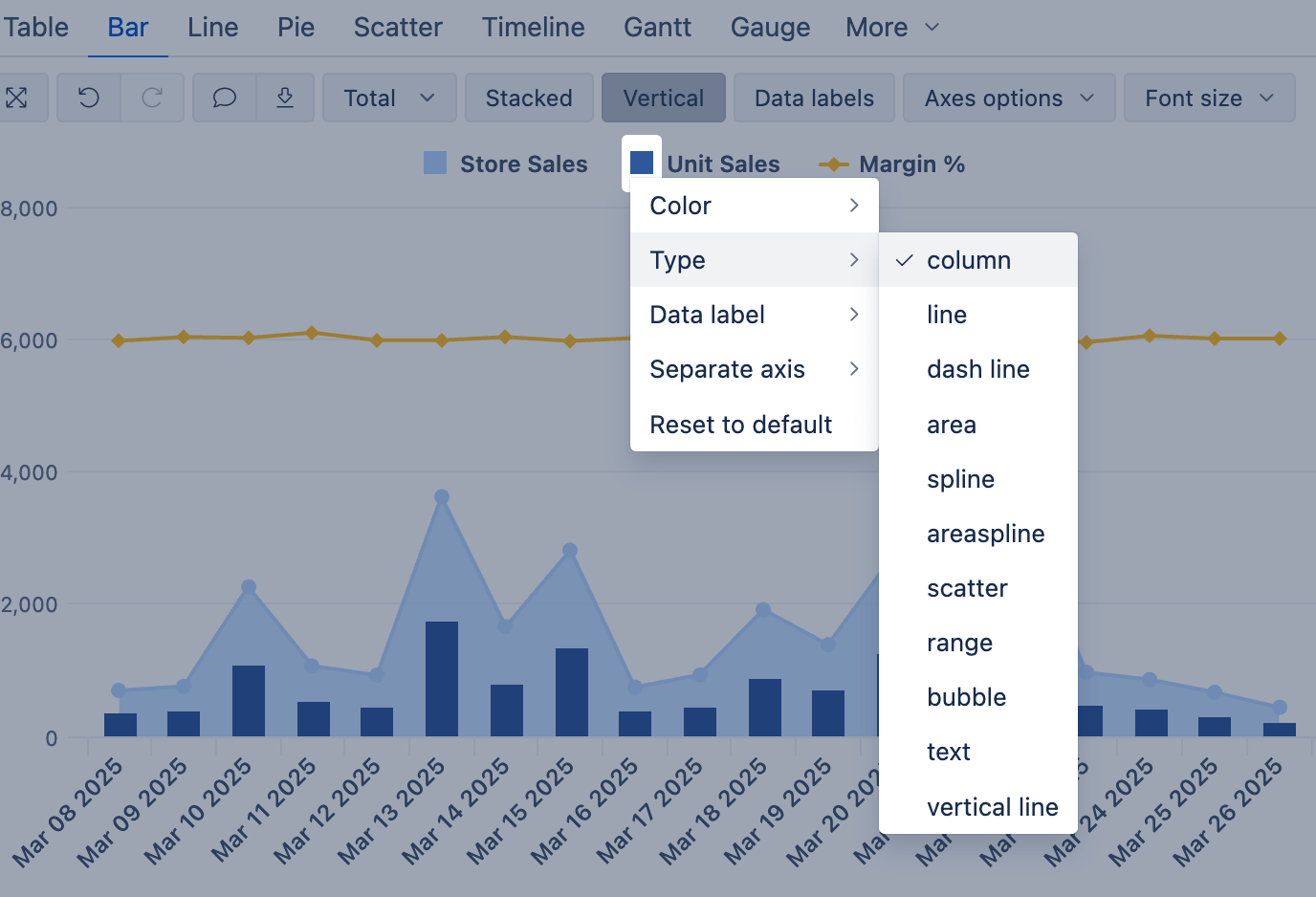
In the chart legend, click on the symbol of a measure to adjust how it is displayed in the chart.
Use this to build mixed charts, for example, select one measure to be displayed as a column and another as a line.
In this example chart, Store Sales are shown as area, Unit Sales as columns on one axis, and Margin % as a line on another axis.
Click the symbol to adjust the following display options:
- Color – change the color or apply conditional formatting
- Type – display the measure as a column, line, area, or other
- Symbol – adjust the display symbol of line, area, or scatter Type measures
- Data label / Name label – enable/disable or adjust the orientation of data labels
- Separate axis – move the measure to a separate axis
- Stacked – choose which stack the measure should belong to (when Stacked chart option is enabled)
- Reset to default – reset all adjustments to default
See the video – how the measure display options can be adjusted to create a chart like in the example:
Measure options
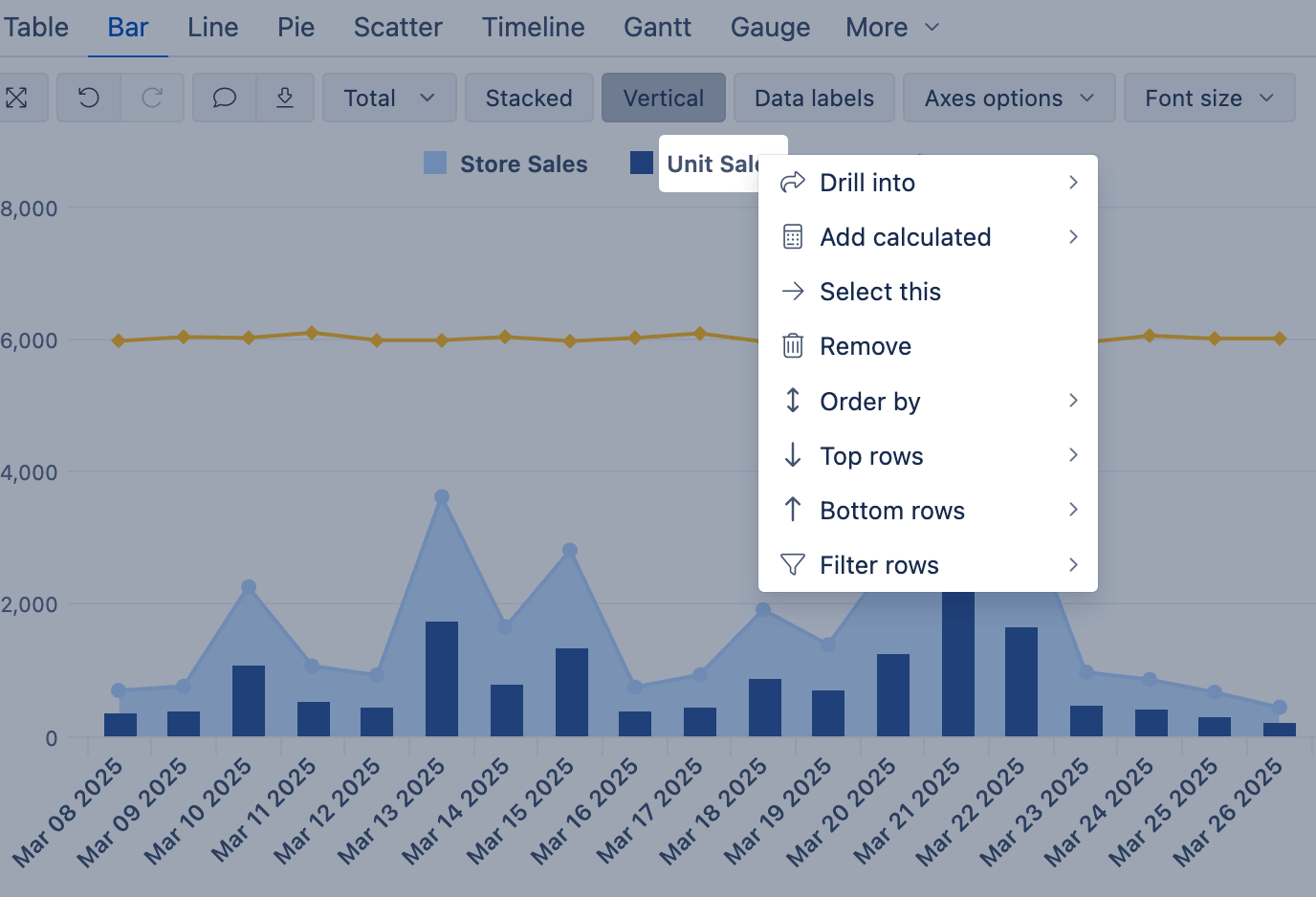
In the chart legend, click on the name of a measure to adjust measure options.
These same options are available in Table view when clicking on the column header of a measure.
- Drill into – drill into measure by another dimension level
- Add calculated – add a standard calculated measure based on the selected measure
- Select this – remove all other measures
- Remove – remove the selected measure
- Order by – order by the values of the selected measure
- Top rows – show only row members that have Top N values in this measure
- Bottom rows – show only row members that have Bottom N values in this measure
- Filter rows – filter rows based on measure values
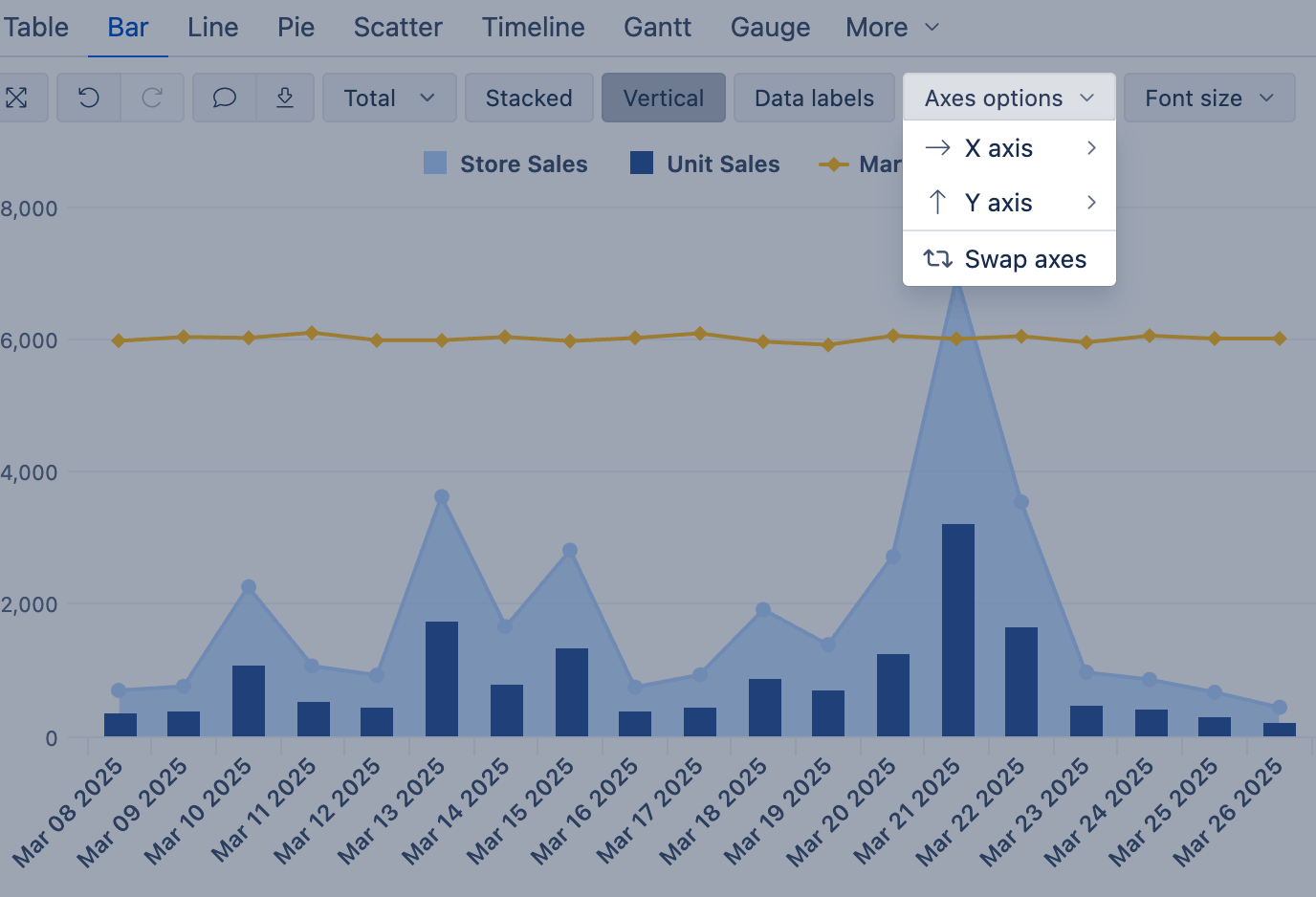
Axes options
Use Axes options to improve clarity and add context to your chart:
- Add titles to label each axis clearly
- Use prefixes or suffixes (e.g., $, %, USD) to describe the values
- Set min, max, and step values to control the visible range and guide user focus
- Adjust the label orientation for the X axis (for Bar and Line charts)
Use Swap axes to switch the dimension and measure between the X and Y axes.
See the video – how to bring the final touches to the chart with Axes options: